
What? You can control indexing? Yes, & here's how.
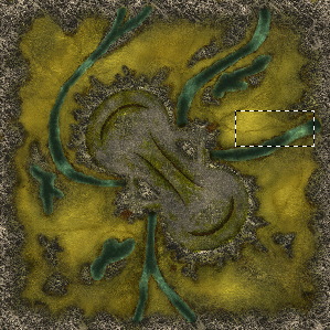
First let me introduce you to the Victim of this Tutorial. We're calling it Vertigo & it will be a large Team Map released with The Seventh God.
The small marqueed area will be the trouble area we will be dealing with in this tutorial.
Any mapmaker knows that you spend alot of time building what you feel is a great colormap only to have it Ruined when you index it to 240 colors. I've been through it, but through a trick I discovered when dealing with Index Colors for multimedia projects you can work wonders.
First, you should still try to keep the number of Unique colors down when building your colormaps (cmaps). Normally if you have a blue water, a green grass, a nice tan sand & Gray Mountains you're really starting to push it. It's better usually to try to work out of the same area of palatte rather than picking wildly opposing colors.
Why? When you index a map Photoshop takes your 24 bit RGB image & reduces it to 240 colors. That process leaves you with only 240 colors to make up a natural looking landscape. When you use colors that are from the same area of the palatte (Tans, Browns... Blues, Grays... etc) it allows these indexed colors to crossover & be used in other areas than just Grass or Hills. When your colors are wildly Varient these indexed colors are more apt to keep to their own areas & not be able to crossover. This is when you start to see "Banding" in your colormaps.
Banding is when there is a wide jump from one color to the next & in Myth that means you can see those nasty blocks of color when your playing the game. One way to help out with Extremely flat looking color is to simply add some Noise to your colormap to break up any solid blocks of color that may exist. I use the noise filter... Gaussion, Monochromatic & set to about 3 or 4 at most. This does nothing more than keeps the indexing from deciding that this is all the same color & thus turning it to solid which looks like crap in Myth. That is little tip 1.
Now for the more indepth stuff.
Here is the Marqueed section from the above colormap up close.
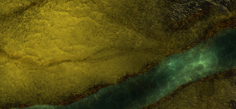
It's smooth, pretty & would be fun to tromp around on & blow shit up on. BUT, due to the amount of other colors on the map these section get the short end of the stick when I index the map. So, this section is a good example of what I do to help out indexing of a colormap. We'll be working with the Grass section & the Water section.
Heres how each of these sections looked when I let Photshop do as it sees fit when indexing this colormap. The grass got completely unacceptable & lost any subtle detail to it which also seems to happen alot with Sand on maps. The water also lost any detail in the highlight section & would be completely irritating to walk through in a game of Myth.
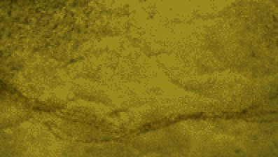
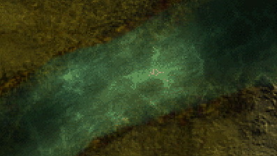
So... now is where you learn. Go back to your Unindexed colormap in Photoshop. Take the Marquee tool & draw a marquee box around a small portion of an area that you are Losing when it gets indexed. After that, tell Photoshop to now Index your colormap to 240 colors again. WOW, that area now looks Great!
What happens is that by drawing a marquee box you are telling Photoshop to Index that specific area "first" before moving on to the rest of the colormap. Heres how the revised indexing looked on each of my samples.
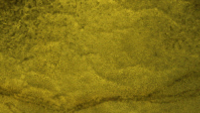
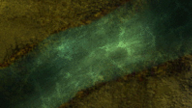
As mentioned before... these areas/colors now index "before" others & that forces these primary areas of concern to look Great. The downfall to it is that there are other areas of the map that now may have less detail to them, but most of the time things seem to even out.
What I actually do for my final indexing is to draw "MULTIPLE" marquee boxes around specific areas that I feel are important & then tell Photoshop to index the colormap. When it's done I look over the map & see what I think of the results. If I still do not like the results I Undo & go back & reMarquee different areas & go back & forth with this process until my colormap looks exactly like I want it to in Indexed form.
Now I admit that I often Push the Limits of what should be tried when building a colormap. Basically every one of my Personal maps are experiments in one form or another. I may be playing with Color Combinations or Types of Displacements or Design, but no matter what I do, this process almost always ends up making me look great.
Enjoy the Tip & look forward to more Tip-Torials on advancing your skills & abilities.
Clem
|

